ShopDreamUp AI ArtDreamUp

Deviation Actions


Description
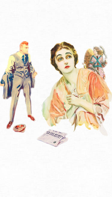
This was the page I've least liked so far in Light Eater...it just felt too bland somehow to me...it didn't feel like it belonged, even if it was comprised primarily of close-ups, to the baroque, romanticized, rococco-sugar fest that was being imagined by a young girl. Aside from being bland, it also felt as though their was something about the space was ambiguous.
So I just said, hmmm...how can I make this feel like it fit in a bit better. The gold bars running through the fake marble seemed like it might be a good way to define the space better (Even though technically, considering what I presented as the church in page 2 this type of thing shouldn't exist.)
Anyway, much happier with this revised version.
Next page - [link]
Previous page - [link]
As always, "Light Eater" and etc. therein belong to me, no stealing.
Image size
612x792px 133.62 KB
Comments17
Join the community to add your comment. Already a deviant? Log In
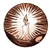
I love how gilt-framed this whole thing is- a perfect little daydream sequence. But the part that makes me go "squeeee ^^!" for some reason is the little blurry picture seuqence in the corner between the groom and the priest- like we're peeking in on them through a window :3.